


Blog
LCD Display Masturbation Cups: What Should the Screen Show—and What Must Retailers Test?

A screen can look premium but still confuse buyers. Unclear icons, mismatched buttons, and poor sealing can create avoidable support issues.
An LCD display masturbation cup adds value when the screen clearly shows useful states such as battery, mode, intensity, lock, timer, charging, or errors—and when those states match the buttons, manual, and final product sample.
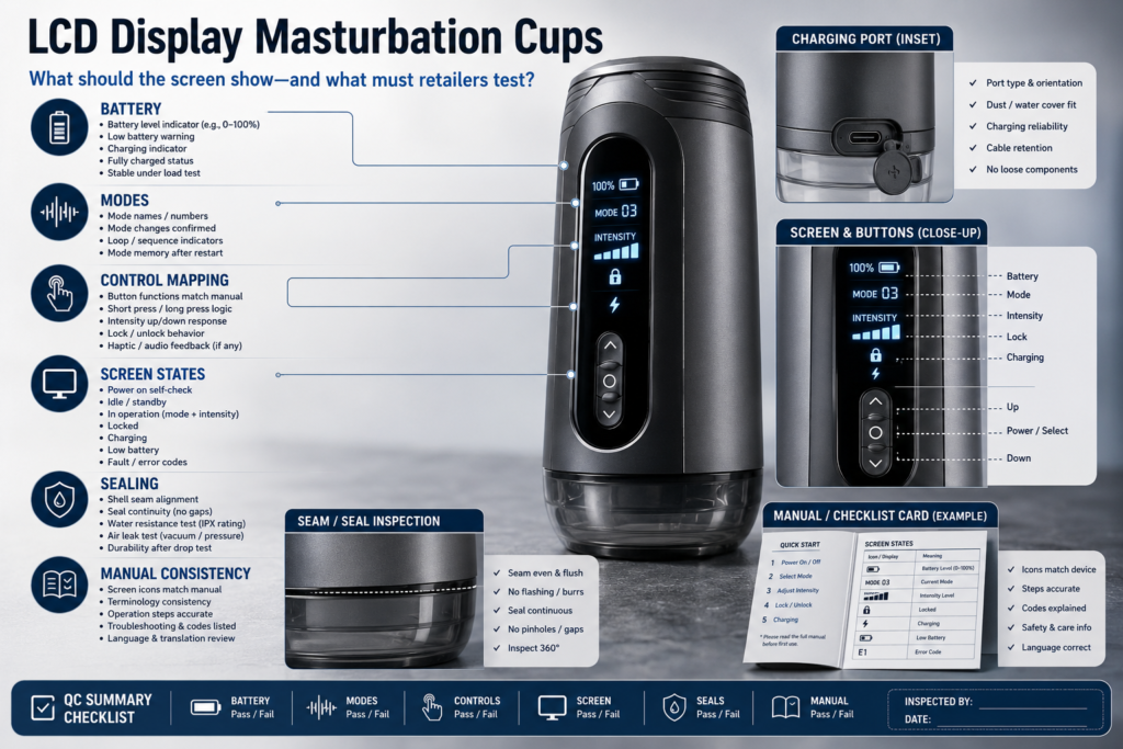
At WM Custom Dolls, we treat the screen, controls, manual, retail box, and quality-control process as one connected system. An LCD can make a product easier to understand, but only when each display element has a clear purpose and behaves consistently on the production-intent sample.
This is not a general article about “smart” products. It is a practical guide for adult buyers, retailers, distributors, and private-label teams reviewing an automatic male masturbator LCD interface. The goal is to identify what should be verified before a product listing, packaging file, or bulk order is approved.
What Should an LCD Display Actually Tell the User?
A decorative screen may add cost without adding clarity. Buyers need information that helps them understand what the product is doing, rather than animation that simply repeats a button press.
A useful LCD should communicate product states that help the user operate, charge, pause, lock, or troubleshoot the device. Every icon, number, and animation should have a defined function.
The best starting point is a simple question: what decision does this screen help the buyer make? A logo animation may look polished, but it adds little practical value. A battery condition, selected mode, intensity level, timer, lock state, or charging indicator can help a buyer understand the product without guessing.
A display screen sex toy does not need to show every possible detail. Too much information can make a small interface harder to read. Priority should go to states that genuinely change how the product is operated or maintained.
| Screen Element | Useful When It Helps the User |
|---|---|
| Battery icon | Indicates charging or remaining battery condition |
| Mode number or icon | Confirms which documented operating mode is selected |
| Intensity level | Shows a changed level when controls adjust output |
| Timer | Helps only if the model includes a verified timer function |
| Lock icon | Confirms a documented travel lock or button lock |
| Charging icon | Shows the charging state if supported by the model |
| Error symbol | Identifies a documented issue requiring a specific action |
Before adding any of these labels to a product page, confirm that they exist on the exact SKU. Do not assume a product has a timer, lock function, battery percentage, touch controls, or fault warning simply because another model in the catalog includes them.
For retailers, the screen should support the product’s main controls rather than compete with them. A clear battery symbol and mode indicator may be more useful than a complicated animated interface. Photos or short videos of each important screen state from the approved sample can also provide a useful reference for content and customer-service teams.
Which Screen States Need to Match the Manual?
A screen that does not match the manual creates doubt immediately. Buyers may press the correct button but still see a symbol they cannot identify.
Every LCD state should match the final manual, control labels, packaging claims, and product page. The icon, sequence, and meaning of each documented function should remain consistent across all of them.
A product interface is only as clear as its complete information chain. The physical button, screen symbol, quick-start card, full manual, listing images, and customer-service explanation should all describe the same action.
For example, if a short press changes the operating mode, the display should show that change in the same way the manual describes it. If a long press powers the unit on or off, the manual should use the same button icon or label visible on the housing. If a number appears on screen instead of an icon, buyers should be able to tell whether it represents a mode, level, time, or another state.
We suggest creating a control-mapping table before approving content:
| Input or Control | Expected Screen Response | Manual Description to Verify |
|---|---|---|
| Power button | Startup, shutdown, or standby state | Press length and expected icon |
| Mode control | Mode number or mode icon changes | Meaning and order of modes |
| Intensity control | Level indicator changes | Range and adjustment direction |
| Lock action | Lock icon appears or disappears | Activation and release sequence |
| Charging connection | Charging state appears, if supported | Charging instructions and warnings |
This process can expose translation and design problems before packaging is finalized. A manual may refer to “speed” while the screen shows a wave symbol. The box may claim five levels while the final sample shows three. A housing revision may change a button label without the manual being updated.
For private-label projects, UI wording is best finalized after the production-intent sample is available. Early engineering artwork can change, and approving the final control map first can reduce the risk of reprinting manuals, replacing inserts, or answering preventable questions after launch.
How Should Battery and Mode Indicators Be Tested?
A battery icon can create false confidence if buyers expect more information than it actually provides. A mode display can be equally confusing if it skips, resets, or uses labels that are never explained.
Battery and mode indicators should be checked against the real control sequence and charging behavior of the final sample. Retailers should document what each state actually shows rather than making broader claims about display accuracy.
Battery indication is one of the most useful LCD features, but it is also easy to overstate. A battery graphic may show charging, low battery, or several bars. That does not automatically mean the device provides a precise percentage or can accurately predict remaining runtime.
Retailers should avoid claims such as “accurate battery percentage,” “real-time runtime,” or “never lose power unexpectedly” unless the model has documented features and testing to support them.
Instead, test the practical questions:
- What appears when the charging cable is connected?
- Does the screen change when charging begins or ends?
- What low-battery symbol, flash pattern, or message appears?
- Does the manual explain the symbol clearly?
- Does the display return to a known state after restart?
- Do mode changes appear in the same sequence described in the instructions?
- Does the screen show a state after a long press, short press, or lock action?
Mode testing should cover every mode and level shown on the final production sample. Recording the full sequence in a short QC video creates a more reliable internal reference than relying on an early promotional image or supplier spreadsheet alone.
For example, an automatic male masturbator LCD interface may show “M1,” “M2,” and “M3,” but the manual still needs to explain what those labels represent. Without that explanation, a buyer may not know whether the number refers to mode, intensity, battery level, or time.
Keeping the final sample video, screen photos, and approved manual version in the SKU file also makes future content updates easier if the display logic changes in a later production run.
Why Can a Display Make Controls More Confusing?
A screen is supposed to reduce uncertainty, but it can create another layer of it when the buttons, icons, and instructions were not designed as one system.
An LCD can make controls harder to understand when button labels, screen changes, icons, and manual instructions use different terms. Important actions should receive simple and consistent feedback.
A product with two buttons and a small display may appear straightforward, but confusion often comes from the relationship between an action and the feedback that follows. One button may control power and mode selection depending on press duration. Another may adjust intensity, activate a lock, or reset a setting. If the screen does not confirm what happened, buyers are left to guess.
Common problems include:
- A button icon on the shell does not match the manual artwork.
- A screen symbol has no explanation in the quick-start guide.
- A mode number changes, but the buyer does not know whether it refers to a pattern or intensity.
- The display times out too quickly to confirm a setting.
- A lock icon appears, but the unlock sequence is not explained.
- The product resets to a default state without showing that reset clearly.
- A translation uses different words across the box, manual, and product page.
A practical user-interface review should include a first-time operator test. Give the approved manual and product to someone who has not used that SKU before. Ask them to power it on, identify the selected mode, find the battery state, activate and release any documented lock, and recognize the charging indicator. Note where they hesitate or need to reread the instructions.
This does not require creating new performance claims. It simply reveals whether the product and instructions make sense together. If a reviewer cannot tell what the display means, the issue may be the icon design, control mapping, translation, or packaging copy rather than the hardware itself.
For retailers, precise descriptions are usually more useful than broad phrases such as “intelligent LCD control.” If the final sample supports it, wording such as “LCD screen displays the selected mode and charging status” tells the buyer exactly what the screen does.
What Do Screen Windows and Seals Add to QC?
An LCD creates another interface in the product shell. The display window, button seams, charging area, and housing joints all become additional points to inspect.
Screen windows and shell seals add QC requirements because gaps, cracks, loose panels, and unclear water limits can affect durability and cleaning guidance. These areas should be inspected on the final sample using the model’s documented protection limits.
A display assembly may include a transparent screen window, molded bezel, adhesive layer, button membrane, or separate housing panel. These elements can change how the product should be handled during cleaning and storage.
Do not assume that a display-equipped product is waterproof, splash-resistant, washable, or suitable for full submersion. Water protection is model-specific. If the official instructions do not clearly state the permitted exposure and cleaning method, use conservative wording and avoid directing water toward the display, buttons, seams, charging port, or other electronic areas.
During sample QC, inspect:
| QC Area | What to Review |
|---|---|
| Screen window | Scratches, cracks, clouding, loose edges, readable display |
| Display alignment | Centering, dust under the window, cropped icons |
| Button seam | Consistent fit and response to documented presses |
| Housing joint | Gaps, uneven assembly, sharp edges, loose panels |
| Charging area | Port alignment, cover fit if included, clear charging access |
| Screen brightness | Visibility under normal indoor conditions |
| Startup screen | Correct logo, language, and expected default state |
Screen brightness should be judged practically rather than described with unsupported technical language. Retailers can confirm whether icons are easy to read under normal indoor use, but claims such as “high brightness” or “sunlight readable” should be reserved for specifications that have actually been verified.
If the screen window adds a visible seam, cleaning guidance should make the care route clear. This matters especially for automatic products with removable liners, where the liner and the electronic shell may require different cleaning methods.
Which Translation and Icon Problems Cause Support Tickets?
A small icon can create a large support burden when buyers cannot tell what it means. Translation errors can also make a correctly functioning product appear defective.
Translation and icon problems create support tickets when buyers cannot connect a screen state to a button action, charging condition, lock sequence, or troubleshooting step. Each market version should therefore be reviewed as one complete interface.
Private-label teams often focus first on the front of the box, but the manual, quick-start card, product screen, icon legend, and online listing all need to work together. One unclear phrase can lead buyers to think the product is not charging, a mode is missing, or a lock cannot be released.
Watch for these common issues:
- “Mode,” “pattern,” “level,” and “speed” used as if they mean the same thing.
- Battery symbols described as a precise percentage when they only show bars.
- A lightning icon that is not explained as a charging state.
- Icons that are unclear or too similar at small size.
- Incorrect long-press or short-press instructions.
- Translation that implies unsupported water resistance.
- Product photos showing a different screen version from the shipped model.
- Box copy claiming functions that the final UI does not display.
An internal icon legend can record the actual icon, its plain-language meaning, the action that triggers it, and the matching manual section. This gives content, packaging, and customer-service teams one reference point instead of relying on separate descriptions.
For multi-market projects, the final language should be reviewed in the target sales language before printing. Translating only the manual is not enough if button labels, image callouts, and e-commerce content use different terminology. If an icon cannot be explained clearly in one short sentence, the label, manual graphic, or marketing wording may need to be revised.
For any current product reference, retailers should still confirm the display behavior, controls, and terminology against the latest model-specific sample and manual before publishing those details.
When Does an LCD Feature Justify a Premium SKU?
A screen should earn its place in the product design. Additional components can increase complexity, packaging work, QC requirements, and after-sales support.
An LCD feature may justify a premium SKU when it makes documented controls easier to understand, improves status visibility, and remains consistent across the product, manual, packaging, and QC process.
The screen itself is not the value proposition. Its value comes from removing uncertainty. A useful display may make it easier to distinguish mode changes, confirm a lock state, identify charging status, or see that a button press has registered.
However, an LCD can also add costs and risks:
| Potential Benefit | Possible Cost or Risk |
|---|---|
| Clearer mode feedback | More complex control mapping |
| Charging visibility | Battery icon may be misunderstood |
| Premium shelf appearance | Added screen-window QC requirements |
| Better product differentiation | More manual and artwork revisions |
| Easier troubleshooting | More translation and icon-review work |
Retailers should compare an LCD version with a simpler button-only model and ask whether the screen provides information the buyer could not easily understand from indicator lights, vibration feedback, or the button layout alone. If it does not, the display may be more decorative than functional.
For private-label brands, the full launch cost matters as much as the component itself. An LCD may require revised diagrams, additional manual pages, translated icon legends, new product photography, box callouts, and updated after-sales scripts. It also creates a version-control requirement: if the screen logic changes, the related support materials may need to change with it.
When the interface is clear and verified, an LCD model can provide meaningful differentiation within a product range. When the interface creates more questions than it answers, a simpler control system may offer a cleaner retail experience. Contact our team to compare available models, documentation, packaging options, and current private-label requirements.
FAQ
Does an LCD display mean the cup is smarter or more powerful?
No. An LCD only shows information the product is designed to send to the screen. Its usefulness depends on whether those states are clear, consistent with the documented model, and genuinely helpful during operation.
What should be shown when the battery is low?
The final manual should explain the exact low-battery icon, flash pattern, or message for that model. Retailers should publish only the indicator behavior confirmed on the production-intent sample and in the approved instructions.
Should every control change appear on screen?
Not necessarily. Important changes such as mode, level, lock, or charging state may benefit from visible confirmation. Minor actions do not always need a separate display state if the control system remains easy to understand.
How can retailers test screen accuracy before bulk approval?
Use the final sample to test each button sequence, charging state, mode display, lock function, startup behavior, and screen timeout against the final manual. Save photos or video, record discrepancies, and approve packaging only after the UI and documentation match.
Conclusion
A screen is valuable only when it makes the product easier to understand. Verify the icons, controls, manual, screen assembly, charging states, and packaging claims together before launch. Contact WM Custom Dolls for wholesale or private-label support.
Planning a Wholesale Order?
Share your product interests, estimated quantity and destination market with our team.
Request Wholesale Information